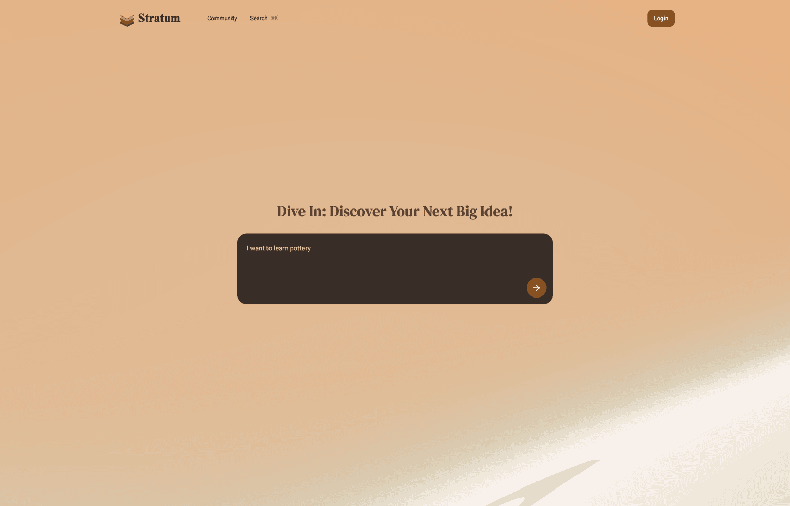
Project Positioning
Designing a career guide instead of another chatbot
Stratum is positioned as a decision-support product. The interface converts AI-generated advice into modules that help users compare career direction, identify skill gaps, and decide the next action.
Role & Scope
Owned UI structure, AI interaction states, and frontend prototype
I defined the product IA, designed the visual system and interaction states, then implemented a Nuxt 3 prototype connected to Gemini API to test the real response flow.
Problem Context
AI career advice is useful but difficult to trust and scan
Raw AI output often arrives as long, uneven paragraphs. Users may receive a lot of content, but still struggle to understand priority, credibility, and what to do next.
Design Goal
Make AI advice readable, paced, and actionable
The design goal was to reduce cognitive load during generation and after reading. The page emphasizes clear modules, progressive feedback, and visual anchors instead of presenting AI text as one continuous block.
Interaction Insight
Users scan AI advice before they trust it
The core insight was that users do not evaluate AI advice only by content volume. They first look for headings, evidence, labels, and next actions to decide whether the response is worth reading in detail.
Challenge & Trade-off
Design predictable containers for unpredictable output
The main challenge was that Gemini responses could vary in length and structure. I used fixed UI sections, streaming feedback, and card hierarchy so the prototype could handle variable content without making the page feel unstable.
Key Decisions
Turn unpredictable AI output into predictable UI sections
- Separated the answer into career direction, evidence, skill gaps, and next actions so users can scan by intent.
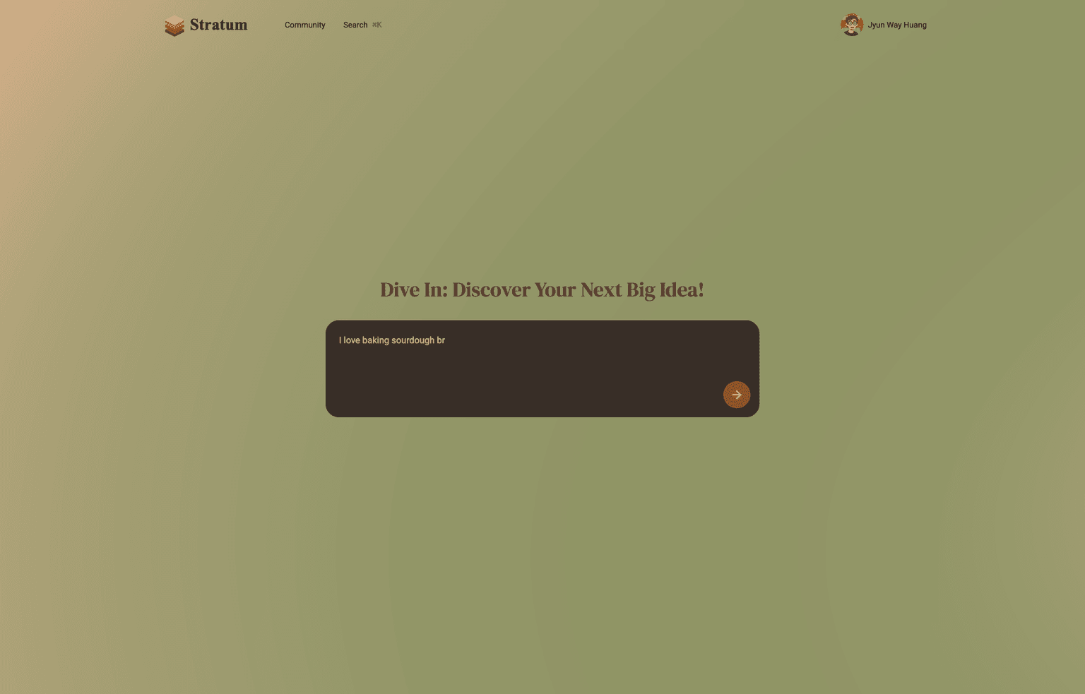
- Designed streaming feedback to show progress and reduce uncertainty while the API is processing.
- Used high-contrast labels and card hierarchy to make AI recommendations feel easier to compare.
Key Screens
From raw AI data to a structured career roadmap
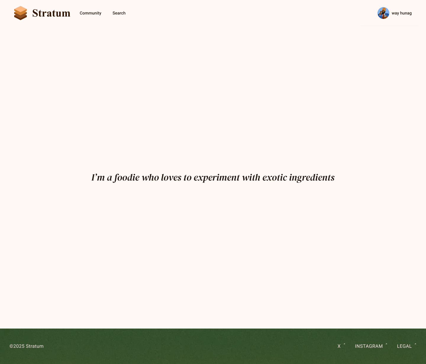
The key screens demonstrate how unstructured JSON-like output becomes a readable interface with hierarchy, grouped sections, and visual anchors.
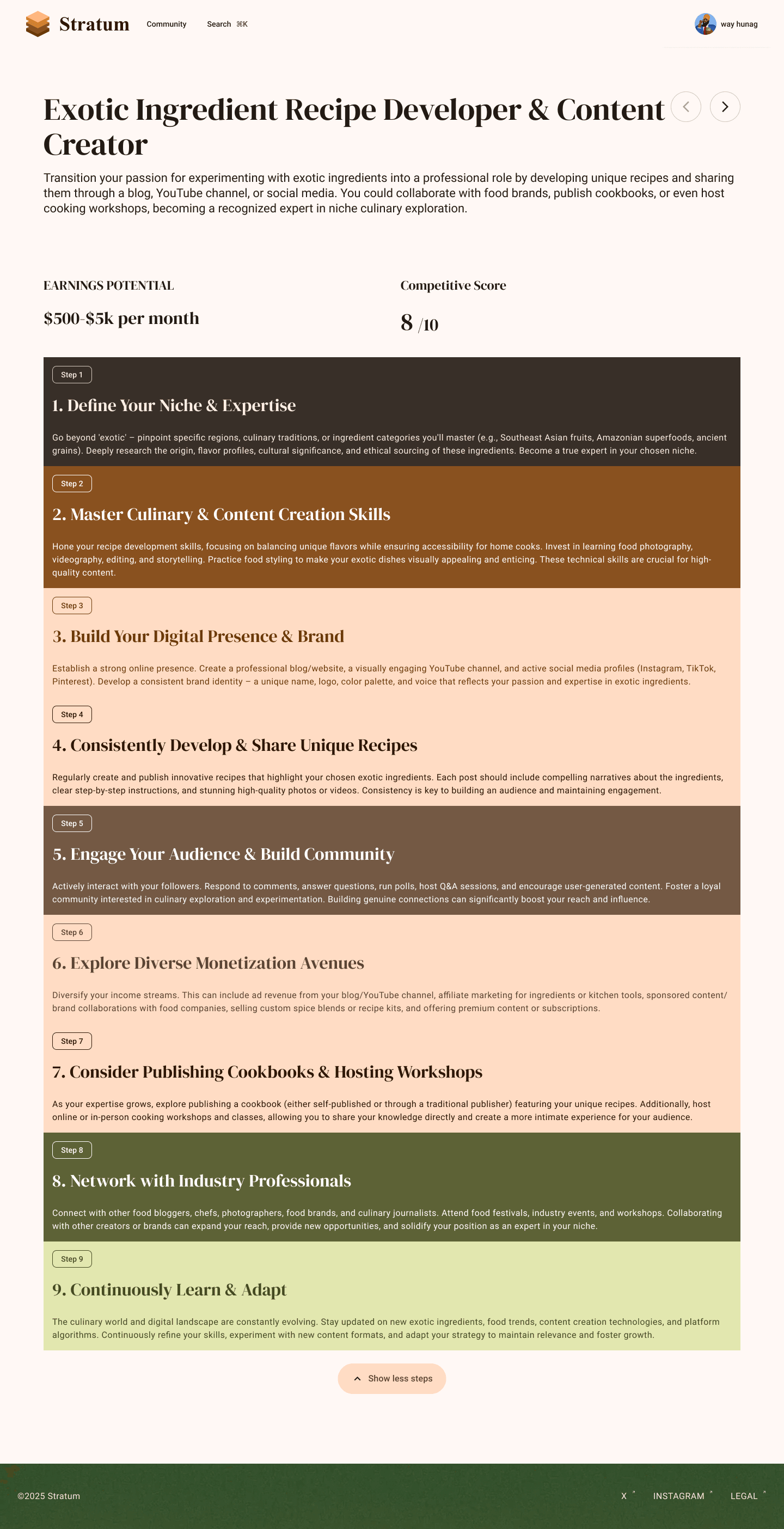
AI Product Case
Designing for uncertainty, not only the happy path
Because AI responses vary by prompt and model output, the interface needs predictable containers, progress feedback, and clear next actions.
- Structured output modules reduce the risk of long, unfocused AI paragraphs.
- Streaming motion gives users feedback before the full answer is complete.
- Recommendation cards make it easier to compare options and question AI suggestions.
Design System Case
A dark interface built around contrast and focus
The visual system uses a controlled mesh gradient, high-contrast accents, and repeatable card patterns to keep dense AI information readable.
Small-scale usability checks focused on whether users could understand the first recommendation quickly and identify a next action without reading every paragraph.
- 3 sec
- First concept recognition target
- 4 modules
- Career answer structure
- 1 prototype
- Live AI response flow
Reflection
Next iteration should make AI confidence more explicit
The current prototype improves readability, but the next step is to make confidence, sources, regeneration, and follow-up questions more transparent.
- Add clearer regenerate and refine controls for users who want to adjust their career context.
- Expose why a recommendation was made so the advice feels more accountable.