Design Highlights
- Design System: broke "margin" into four layout principles — black and white plus one accent, zero corner radius, and at most one primary button per section
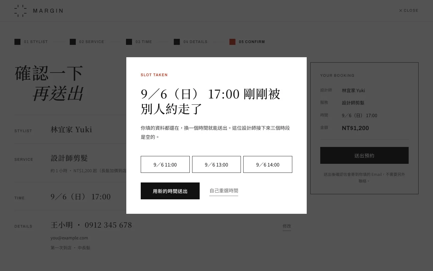
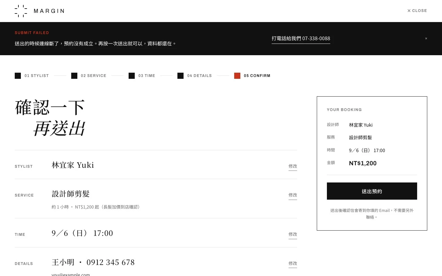
- Interaction States: beyond the five-step booking, designed three edge states — no room that day, slot taken by someone else, and submission failed
- Decision Log: recorded 12 design decisions in the PRD, each stating what was given up and how the cost is covered
Positioning
A fictional salon, taken from spec documents to a site you can actually book on
This is a self-initiated concept project: the brand, address, stylists and imagery are all fictional, and the site is set to stay out of search engines. I wrote the PRD, site-wide copy and SEO spec, and designed the high-fidelity mockups and the MARGIN design system with Claude Design. The site code was written by Claude Code; my part was defining requirements, reviewing and accepting the work, making the call whenever the spec and the build disagreed, and writing those calls back into the decision log.
Problem & Goal
Salon websites break at three points on the way to a booking
Salon customers make almost the whole decision on their phones: browse the work, check the stylist, check the price, book. Most salon sites stall along the way — the portfolio looks like five different shops, booking means calling or messaging on LINE, and the big photos never show who will actually do your hair. So the site has a single conversion goal: bookings. The main audience is people looking for a new stylist, and what they fear most is the upsell, the surprise surcharge, and ending up with someone whose work they have never seen.
Key Decisions
Every decision records what it gave up
- Built booking in-house instead of embedding a widget: embedding takes half a day and building takes about two weeks, but booking is the site's only conversion — its most important page should not wear someone else's design.
- Published every price: it speaks directly to the fear of surprise surcharges. The cost is losing quote flexibility, so every price is shown as "from" with the surcharge conditions spelled out.
- Removed the breadcrumb and the header booking button: the site is only two levels deep and every page already ends with a booking block, so a header button would put two primary buttons on one screen. The cost is one fewer way in, covered by a persistent booking bar on mobile — with the rollback condition set in advance: if booking click-through falls below 8%, the header button comes back first.
- No before-and-after: there were no real "before" photos, and pairing unrelated pictures would be false advertising in this industry. Bleach labels and colour codes on the work pages, plus a clear list of hair conditions the salon will not take, carry that job instead.
Key Screens
A brand site that says one thing per screen
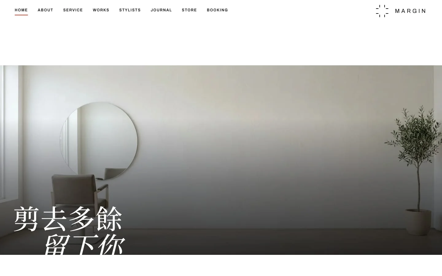
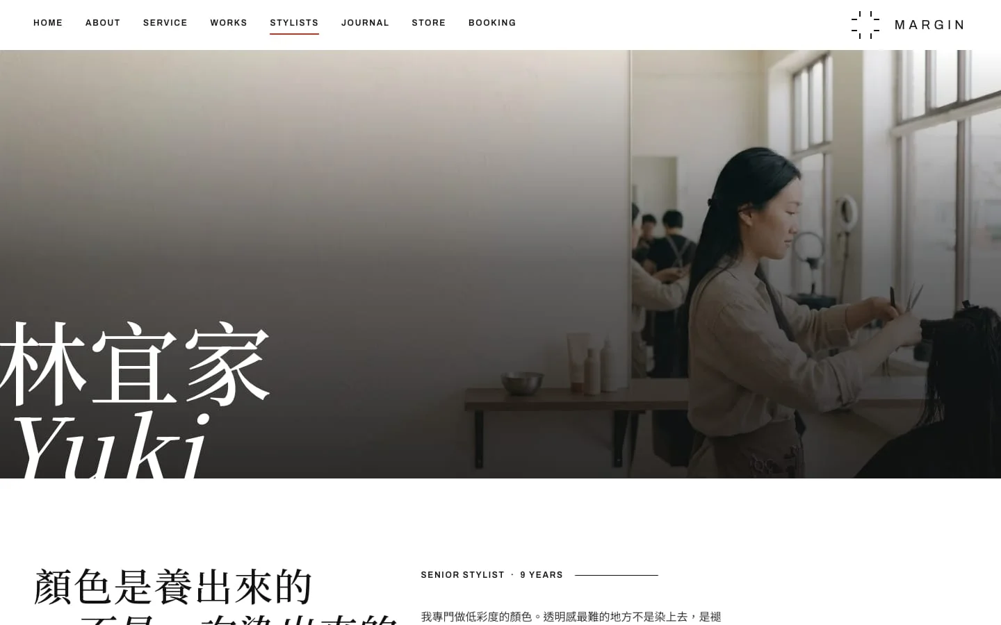
The home page, portfolio and stylist pages all follow the same margin rules. The accent colour marks state only, never actions — if buttons were red too, the signal would stop meaning anything.

Interaction Design Case
Designing for when booking goes wrong, not only the happy path
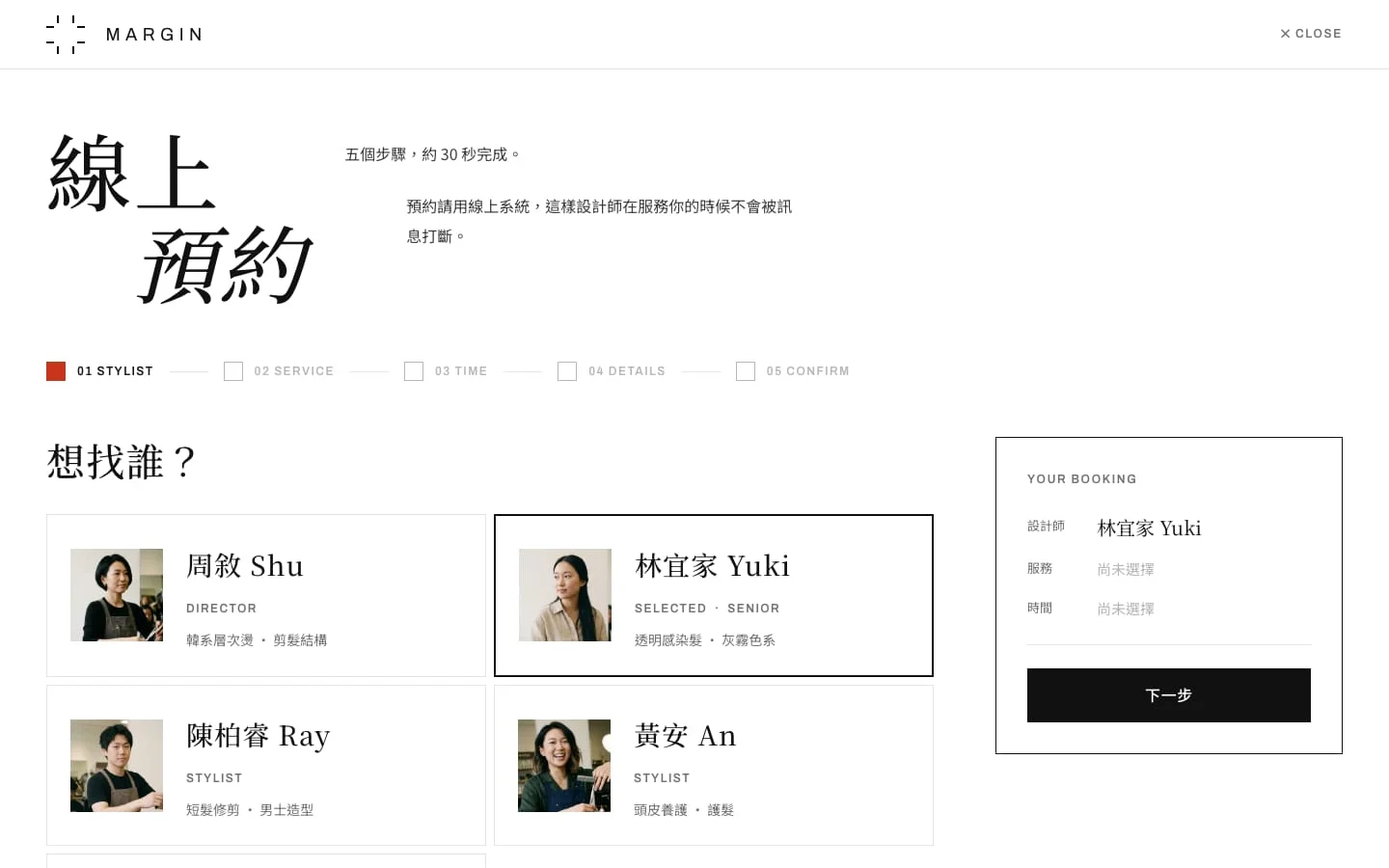
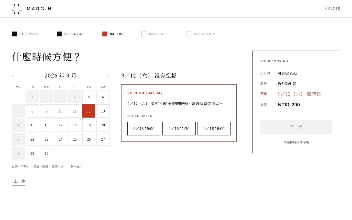
Pick a stylist, pick services, pick a time, fill in details, confirm. Availability comes from Google Calendar: "one customer at a time" maps exactly to "one calendar per stylist", so the salon has no new back office to learn. The cost is that booking is not atomic — a slot can be taken between checking availability and submitting — so the flow has to design for that moment.
- The summary panel enlarges the value just chosen and labels undecided fields "not selected yet"; when the button is disabled, the reason is written right below it.
- No room that day: the date turns the accent colour and three alternative slots are offered on the spot.
- Slot taken by someone else: a dialog explains what happened and offers the three remaining openings on the same day, with the option to pick a time yourself.
- Submission failed: a dark notice appears under the nav, everything entered is kept so the customer can simply resend, and a phone number is there as a fallback.
- The build also fixed a flaw in the prototype: field errors were checked on "Next", but "Next" stays disabled until the form is complete, so the designed error state could never appear. Validating on blur made it reachable.
Legibility & Imagery
Measuring the white type on every photo
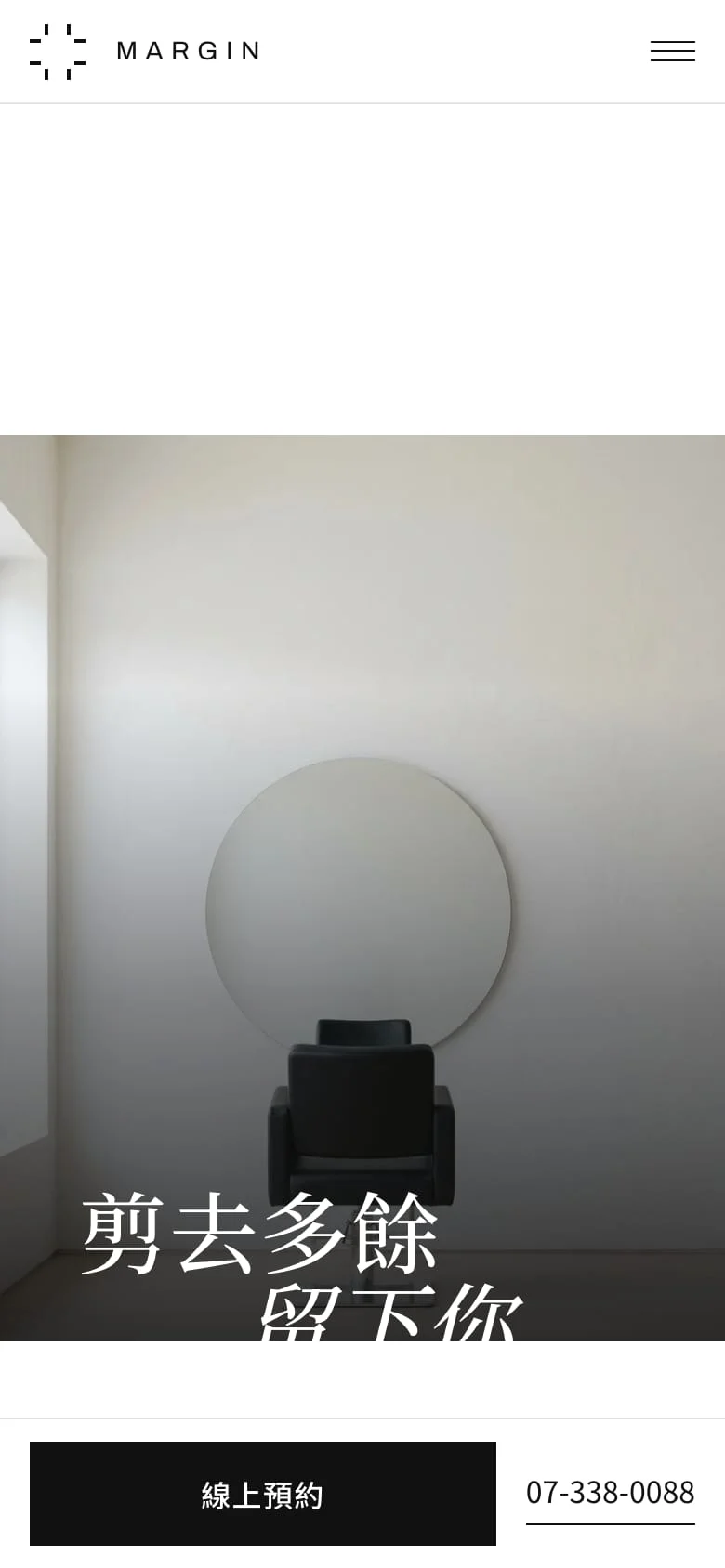
Once AI-generated interior photos went in, the white walls swallowed the white headlines. Each photo was cropped to its slot's aspect ratio, overlaid with the gradient, and measured at the brightest area behind the headline. The stylist page dropped to 1.6:1 at 901px wide and the closing footer block to 1.7:1 — both under the 3:1 AA threshold for large text.
- After retuning the gradients, the lowest contrast anywhere on the site rose to 3.4:1.
- On mobile the stylist page switches to the photo's native 16:9, rather than darkening the whole image just to hold the text.
- With no booking button in the header, a persistent bar at the bottom of the mobile screen keeps the way in, with the phone number as the second option.


This is a concept project with no real operating data. These are the checks I ran on my own design: whether the rules became specs that can be signed off, whether components map to the design system, and whether type over photos reaches readable contrast.
- 12 decisions
- Design decisions logged with their cost
- 23 components
- Components mapped to the design system
- 3.4:1
- Lowest contrast of white type over photos
Reflection
Before real operations: real photography and real validation
All imagery is placeholder for now, and the work photos are stock images from Unsplash. Going live would need real photography with consent, and several decisions that traded one cost for another can only be judged once real data comes in.
- Once real photos exist, bring back before-and-after first to reassure high-spend customers.
- Test the header-button decision against booking click-through, and restore the button if it falls below 8%.
- Add month switching and SMS notifications, and replace the in-memory rate limit with Cloudflare's rate limiting.