Project Positioning
A visual website that makes the band identity immediate
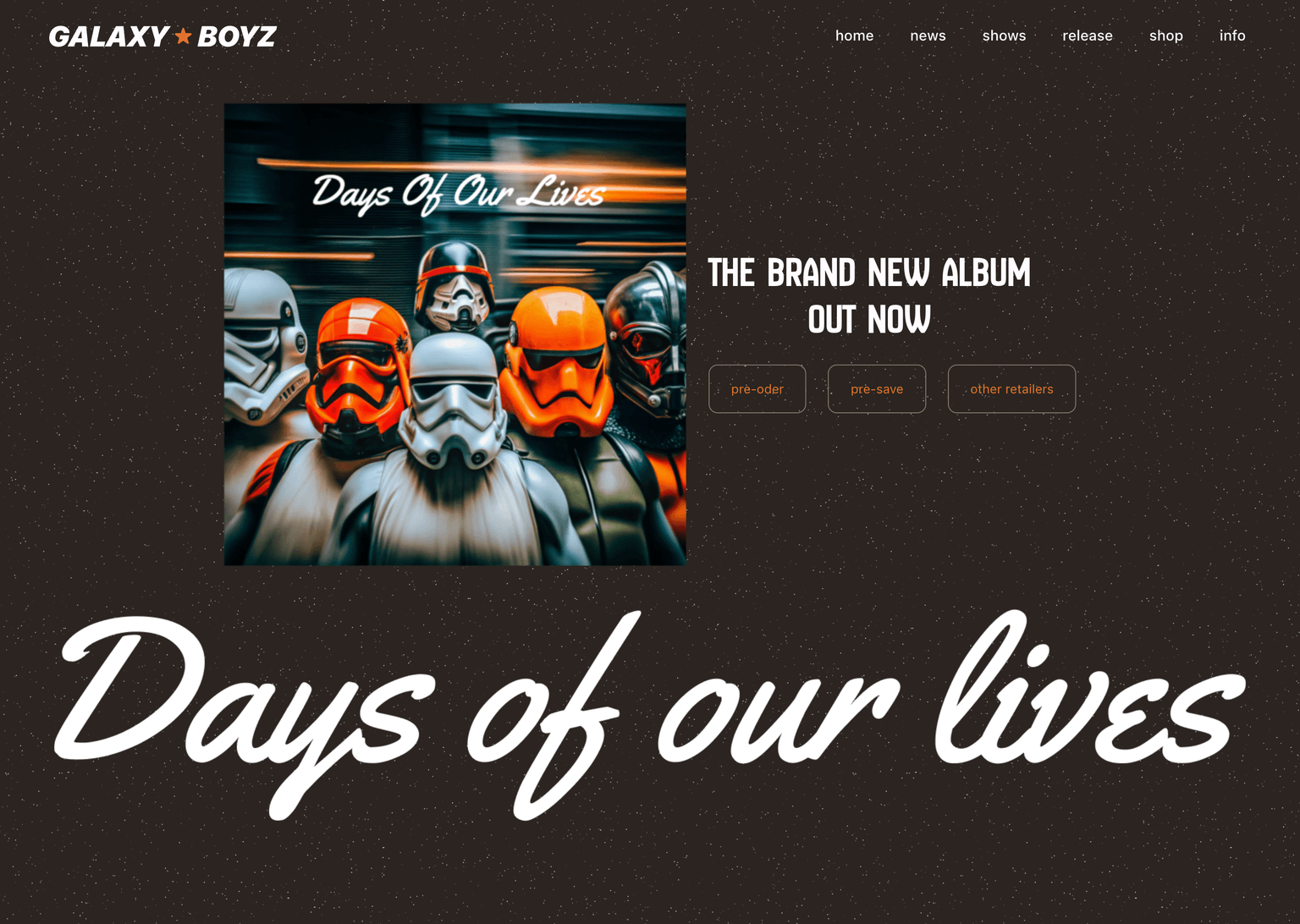
GalaxyBoyz is positioned as an identity-led web experience. The page uses extreme typography, motion, and visual rhythm to make the band personality recognizable before users read detailed content.
Role & Scope
Owned visual UI, responsive grid, and motion prototype
I designed the identity-driven interface, planned desktop and mobile grid behavior, and implemented scroll-based motion with GSAP and Vue 3.
Problem Context
Strong visuals can easily damage readability
Music and entertainment websites need memorability, but oversized type, motion, and unconventional grids can make navigation and content reading harder if they are not controlled.
Design Goal
Create impact without losing orientation
The design goal was to keep the site expressive while preserving clear entry points, readable hierarchy, and responsive behavior across screen sizes.
Visual Insight
Visual impact only works when orientation stays clear
Entertainment websites can earn attention through strong typography and motion, but users still need predictable anchors. I treated navigation, spacing, and section rhythm as the stabilizing system behind the more experimental visuals.
Challenge & Trade-off
Preserve the identity across very different screen sizes
The hardest part was keeping oversized type and asymmetric rhythm expressive on desktop without breaking mobile readability. I planned separate grid behavior for desktop and mobile, then tied motion timing to the layout instead of treating animation as decoration.
Key Decisions
Use controlled contrast as the visual rule
- Used oversized typography as a brand anchor, then paired it with deliberate whitespace to prevent visual noise.
- Designed separate desktop and mobile grid logic so the identity remains strong at both breakpoints.
- Kept navigation and CTA behavior predictable while the surrounding layout becomes more experimental.
Key Screens
Typography, hierarchy, and responsive grid behavior
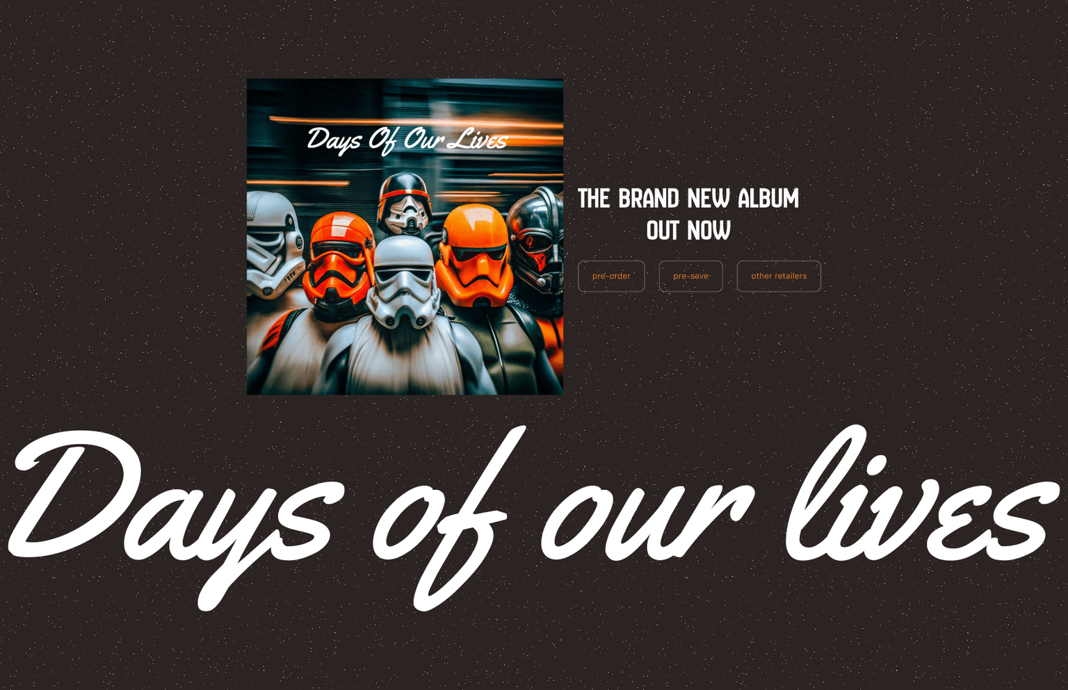
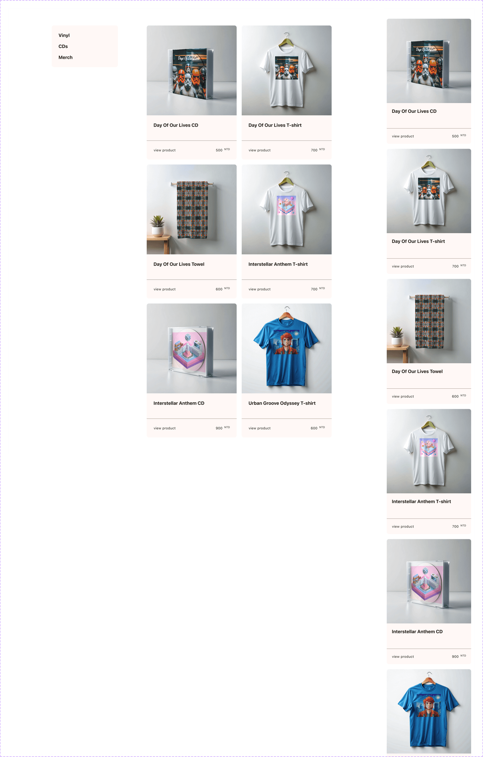
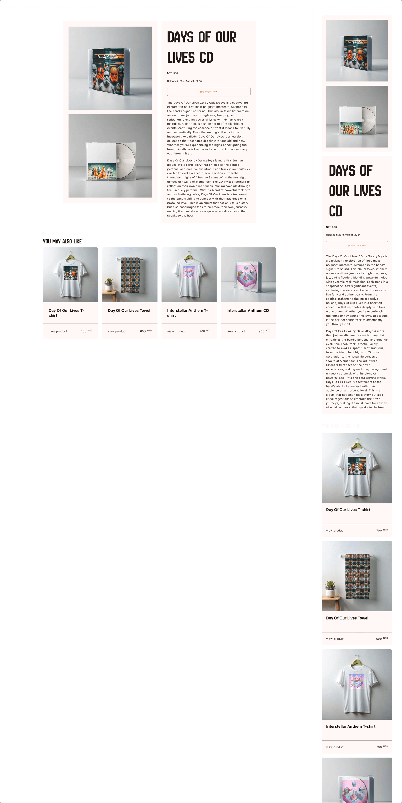
The screen set shows how the same visual identity is adapted from a large desktop composition to a tighter mobile layout.
UI / Web Design Case
Responsive expression across desktop and mobile
The web design focuses on keeping the same emotional tone while changing layout density, type scale, and image rhythm across breakpoints.
Frontend Prototype Case
Motion used as narrative pacing
GSAP and ScrollTrigger were used to choreograph scroll moments, making motion support the story instead of becoming decoration.
- Scroll-driven motion controls when users encounter key identity moments.
- The motion system stays tied to layout structure, making implementation easier to maintain.
Feedback checks focused on whether the visual direction communicated the band personality and whether users could still identify navigation and content sections.
- 2 breakpoints
- Desktop and mobile layout logic
- 12 cols
- Desktop grid foundation
- GSAP
- Motion implementation stack
Reflection
Next iteration should connect visual impact with conversion goals
The current site successfully establishes mood. The next improvement is to connect the identity moments more directly with listening, event, or merchandise actions.
- Add clearer CTA states for listening platforms and event conversion.
- Measure whether scroll motion increases engagement or distracts from navigation.