
Project Positioning
Turning a research-style visual task into an approachable app
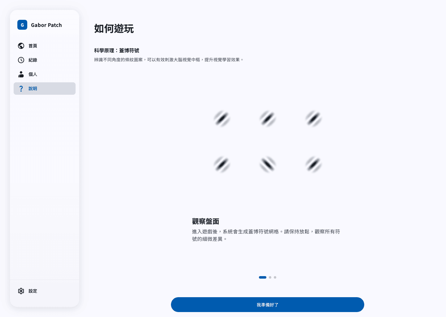
Gabor patch recognition can feel technical if it is shown like a raw experiment. I designed it as a simple app flow for first-time users: learn the task, get ready, complete the grid, then check the result.
Role & Scope
Owned UI design, task interaction, and frontend implementation
I planned the flow, designed the mobile screens in Figma, and built a working Nuxt 4 prototype. This project focuses on whether the training experience is clear and usable, not on proving medical or clinical results.
Problem Context
Visual training can feel abstract without clear feedback
The task asks users to notice small angle differences, but the bigger UX problem is simpler: users may not know what to look at, how many questions are left, or what their final score means.
Design Goal
Make the task precise, calm, and repeatable
My goal was to keep the task accurate, but make the app easy to follow. The screen should not distract from the symbols, feedback should be clear but not noisy, and records should help users come back later.
Interaction Insight
Reduce noise around the perceptual task
The symbols need to be the main focus. I kept instructions, progress, and feedback visible, but made them quiet enough so they do not pull attention away from the task.
Challenge & Trade-off
Balance accurate rendering with app-like interaction
The hard part was balancing accuracy and app usability. I kept the Gabor symbols rendered in Canvas, but avoided making the task screen too game-like. Rewards, sounds, and completion feedback stay light so the task remains focused.
Key Decisions
Design around the training loop, not only the task screen
- Added steps before and after the task grid, so users are not dropped straight into a confusing screen.
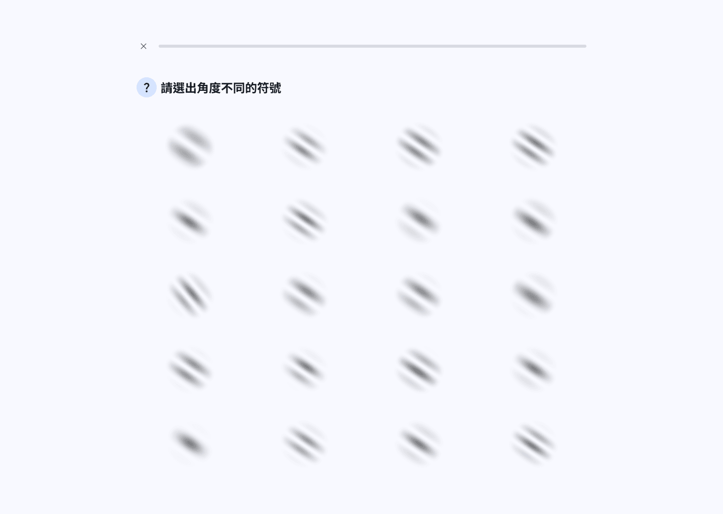
- Kept the task screen simple: question, progress, symbols, and feedback are the only important elements.
- Combined Supabase and LocalStorage persistence so progress can support both authenticated and device-local use cases.
Key Screens
A focused task grid for subtle visual discrimination
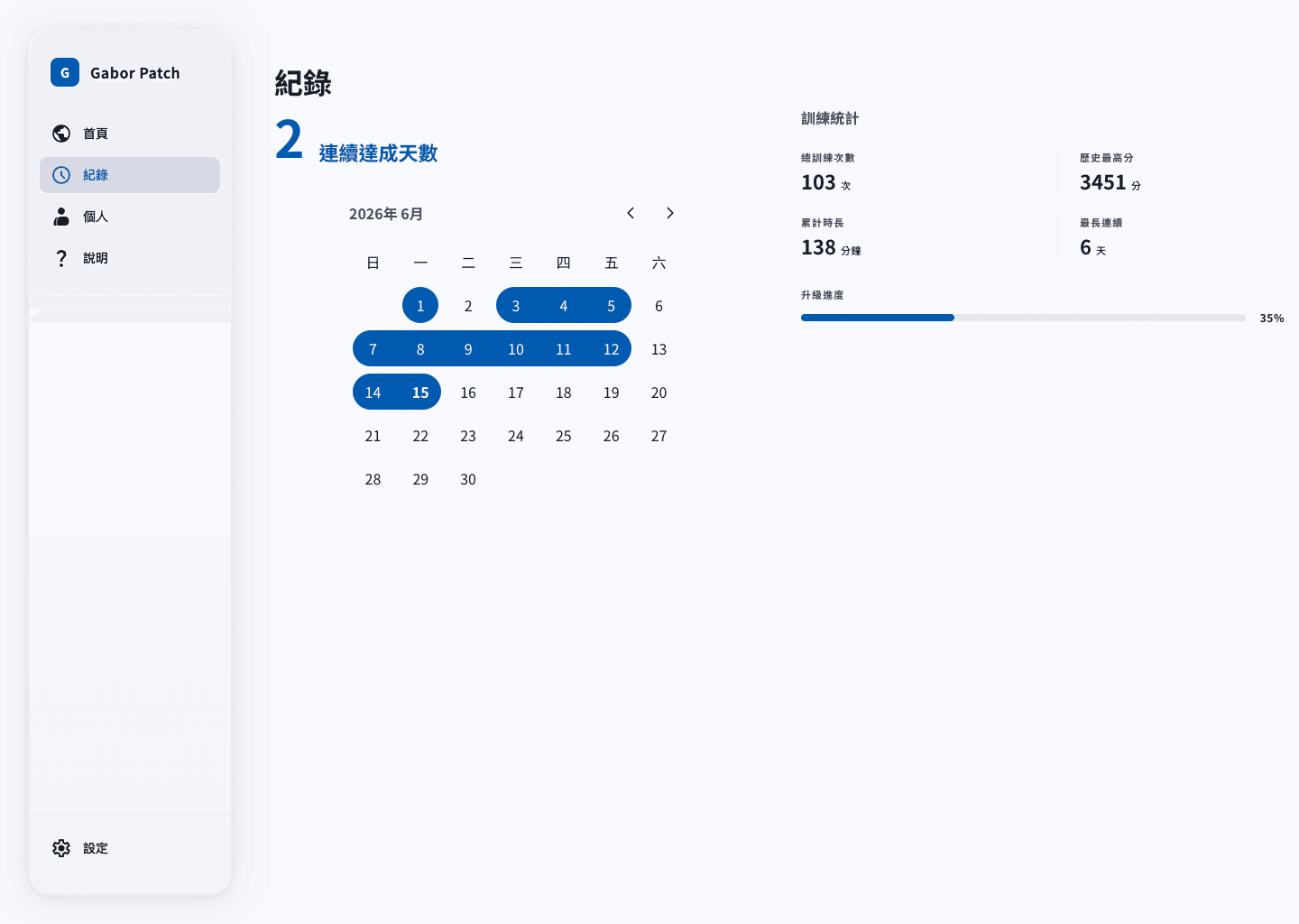
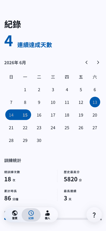
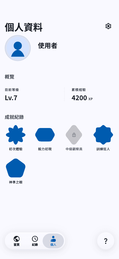
These screens show how the app explains the task, keeps the training screen focused, and lets users review their progress after a session.
Mobile App Case
A flow designed for short daily sessions
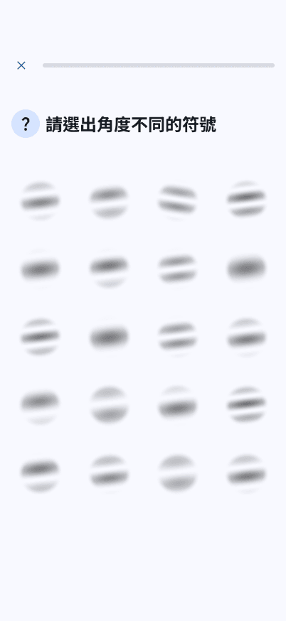
The app is designed for short daily use. Users start from a daily goal, enter the task, finish the session, then check records if they want to review progress.
- A simple progress model helps users understand how much of the current session remains.
- Settings and audio controls keep the experience adaptable to different practice environments.
Frontend Prototype Case
Performance-aware interaction for visual stimuli
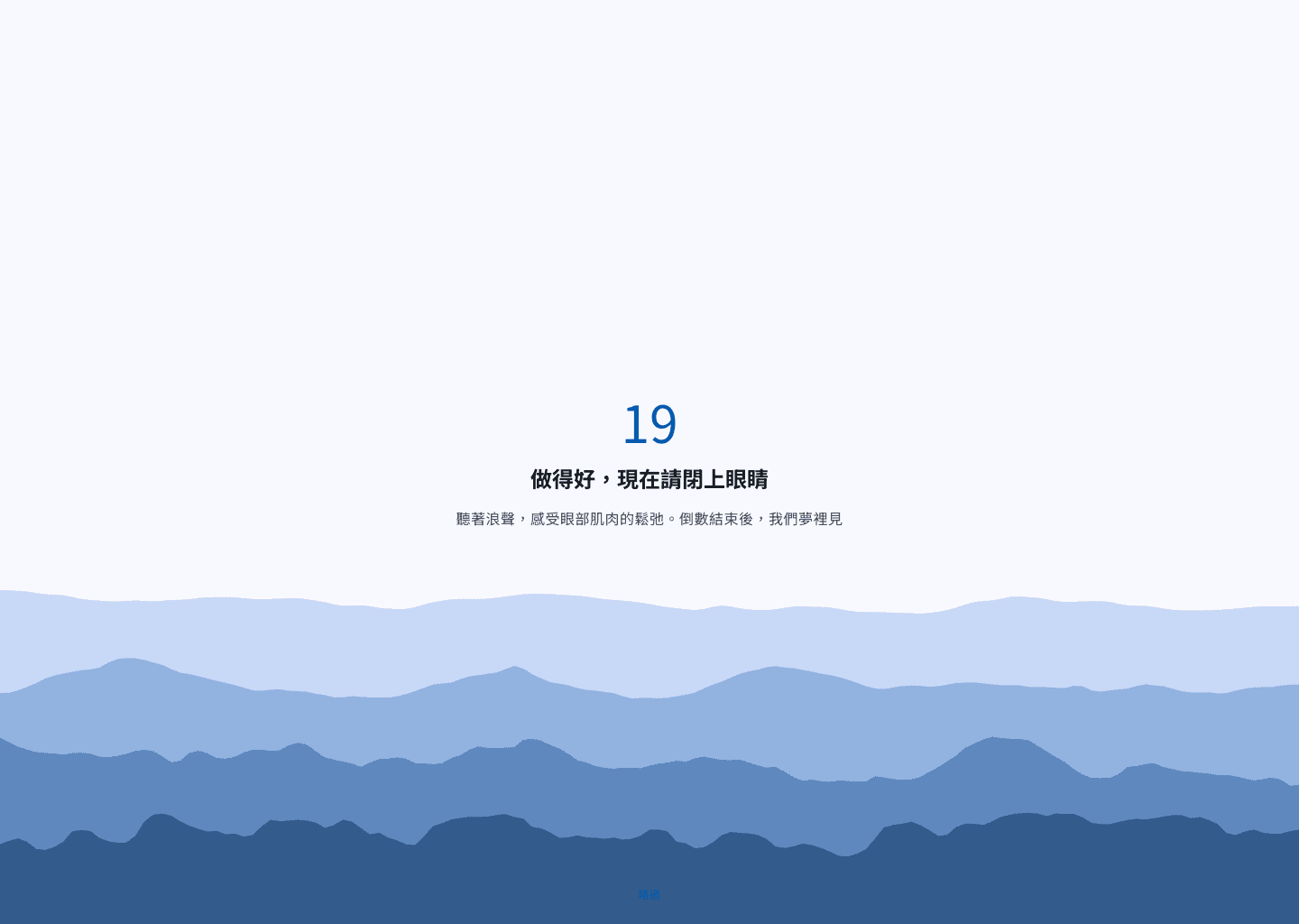
I built a working prototype so I could test the whole session flow, not just design static screens. This helped me check progress, scoring, feedback, saved records, and the rest timer.
- Canvas-based rendering keeps the symbol generation controllable and avoids unnecessary UI-layer overhead.
- Capacitor structure prepares the same product flow for iOS packaging and OAuth deep-link behavior.
This project does not claim clinical results. I checked the prototype from a product experience angle: whether users can understand the task, see their progress, finish a session, and keep their records after moving between screens.
- 8 routes
- Connected into one app flow
- 60 FPS target
- Target for Canvas symbol rendering
- Mobile-first
- Checked for readable text and easy taps
Reflection
Next iteration should make training progress more explainable
The current prototype already has the main task flow. The next step is to make the records page easier to understand, so users know what their score, streak, and difficulty changes mean.
- First, explain accuracy, streak, and difficulty changes more clearly in the records view.
- Second, check whether the task still feels comfortable in different brightness and dark mode settings.
- Third, make difficulty changes easier to understand if the training model becomes more advanced.